On a number of occasions now I’ve had to produce graphs from Excel data. The data is usually monthly statistical in nature and I usually end up wanting to plot a fixed number of months, 3, 6 or 12, on the graphs. With the data being updated on a monthly basis.
In the past I’ve done this the simple but tedious way of adding the new set of data and then editing the Series Data for each series for each graph. Usually this only entailed editing 2-3 series of data. Like I said simple, straight forward but tedious.
Recently however we decided to publish the Monthly ePO Statistics, on the IT Security web site. The statistics consists of two sets of data, one for Workstations/PCs the other for Servers. In addition each set of statistics consists of the number of device, how many are up to date and then how many are missing 1, 2 or 3 updates and lastly how many are missing 4 or more updates.
On two graphs that would give us a total of 12 series of data plus the 2 series for the X-axis for a total of 14 series that would have to be edited each month. However, we also have two additional charts that show the information using percentages. Now we go from 14 edits to 26. Not only tedious but time consuming and being manual prone to error.
So I tried to see if I could automate it a little by using a named range for the beginning and ending row numbers, for the months to be displayed. I wasn’t able to make this work so I did a bit of searching on the Internet and found a solution. The posting I read, and based my solution on, is called Chart the Last 12 Months Dynamically. It turns out that creating dynamically updating charts isn’t quite as simple as I thought it would be. You do use Excel Named Ranges but in a whole lot more complex way than I thought you would.
The end result though is that as I add a new months data to the Excel file the charts automatically update to show the last 12 months of data. In fact the solution is such that by altering the number in a specific cell I can change the number of months displayed
A couple of key points to look out for if you want to do this;
- make sure that you use the name of your data sheet in the formulas. Seems obvious but when you cut and past the formula form a web site it’s easy to forget that you’ve named your sheet ‘Data’ and their example uses ‘Sheet1’. That one cost me a good 15-10 minutes trying to figure out why it wasn’t working 😦
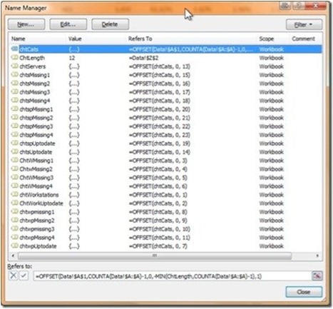
- It can be a bit tedious to setup in the first place. In my example I had to create a Named Range for each series of data that was to be plotted, a total of 23, 22 sets of data to be plotted and the named range for the X-axis.
- It’s easier to follow the example if your data starts in cell A1
So how does this work?
You have your data in rows, each row being a month with the first row being the labels for the columns of data. You add a cell that’ll be used to determine how many months (rows) of data will be graphed. You then define various Named Ranges. The worksheet is called ‘Data’;
- Number of months to plot; chtLength =Data!$z$2
- Chart categories; chtCats = =OFFSET(Data!$A$1,COUNTA(Data!$A:$A)-1,0,-MIN(ChtLength,COUNTA(Data!$A:$A)-1),1)
- definition for the Workstations category; ChtWorkstations ==OFFSET(chtCats, 0, 1)
The chtCats is were all of the work is done. It is then used to define all of the names ranges that you’ll use to generate the charts that you want, in my case;
When you go to create a chart, in Excel 2007, just use the wizard initially. In my case I’m going to use a scatter chart, with lines connected and markers for the plotted points ‘Scatter with Straight Line and Markers’. This will create a blank chart in the currently selected worksheet. Now;
- Select the blank chart, the ribbon will update
- Far right of the ribbon select ‘Move Chart’ and then select ‘New Sheet’ and in the box to the right type the name you want to use; ‘Workstations’
- Right click in the Chart area and select ‘Select Data…’ from the drop down
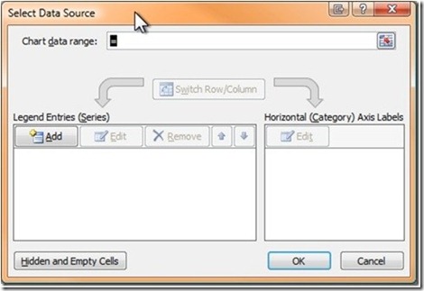
- You’ll see the following dialog box;
- Click in the ‘Chart data range:’ and add type in the names range to be plotted, as in; ‘=Data!chtWorkstations’
- Click on ‘Add’
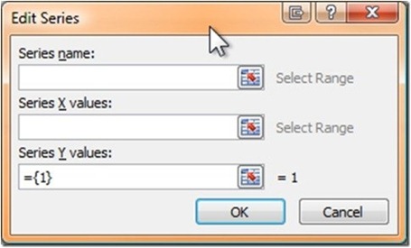
- You’ll then see the following dialog box. Click on ‘Cancel’;
- Select ‘Series1’ and click on ‘Edit’
- In the subsequent dialog box enter the ‘Series name’ and ‘Series X values’ as; “Workstation #” and “=Data!chtCats”
- Click on ‘OK’
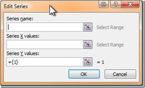
- Type in a name for the ‘Series name:’ “Workstation #”
- Click in the ‘Series X values:’ and enter ‘=Data!chtCats’
You should now have the first series on a chart. You can now add additional series to the chart by right clicking in the chart area and selecting ‘Select Data…’ from the drop down. You can then click on ‘Add’ to add additional series. Then complete the resulting dialog box, shown below, with the Series name, Series X values and Series Y values (=Data!chtCats and =Data!<named range> respectively.
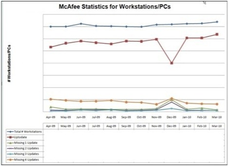
The resulting chart, in my case, produces a chart like the one below. I’ve formatted it they way I want, with Titles etc.;
When you add a new row of information, for a new month, the chart will automatically update to show that last 12 entries, i.e months.
You can change the number of months that are displayed can be changed by updating the number in the Named Range ‘chtLength’ from 12 to whatever you want


